DESIGN CHALLENGE
I participated in a one-week design challenge to improve Möbel Märki's website and increase customer engagement. I had the option to choose one or more of the following tasks:
- Redesign a section of the website
- Develop a Product Vision for the website
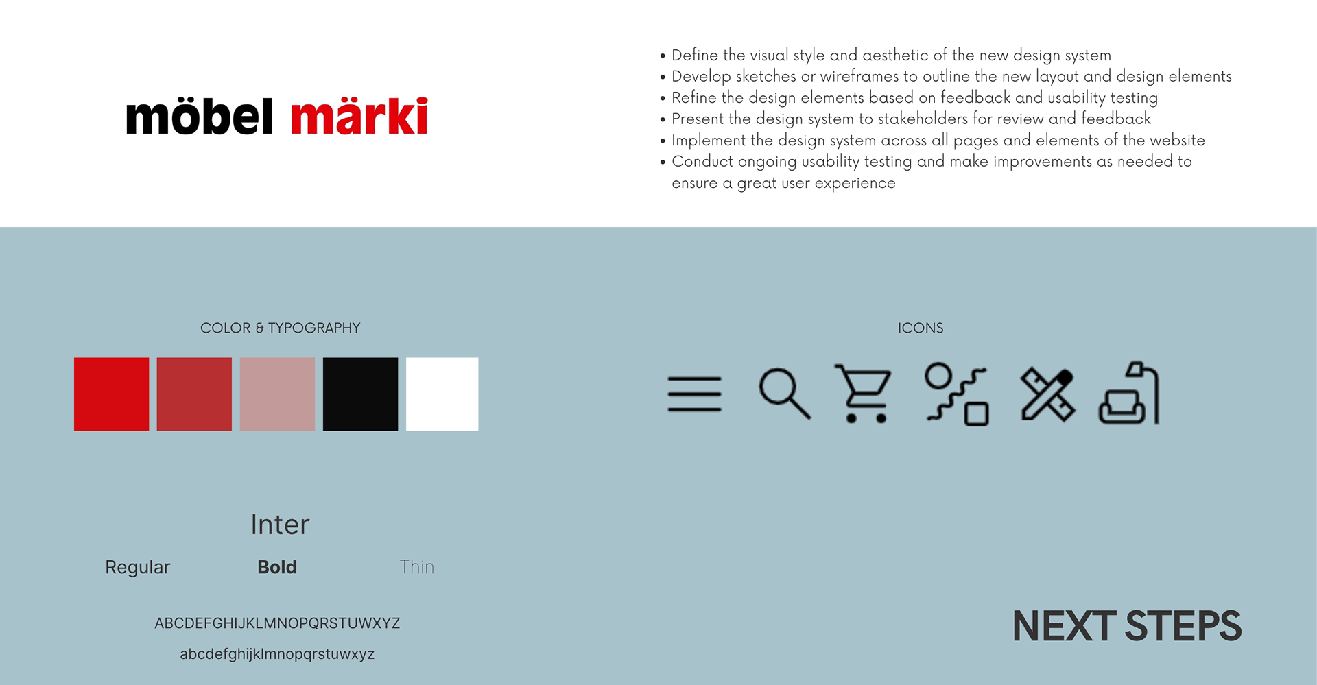
- Create a design system for the website using Figma
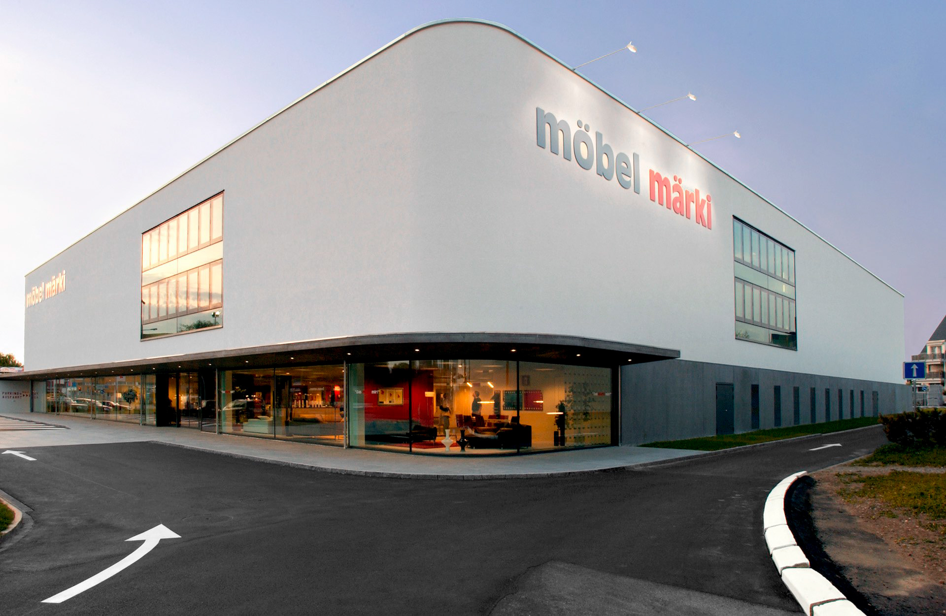
Möbel Märki is a Swiss-based furniture company that offers stylish, high-quality furniture at an affordable price.
The company's aim is to offer sustainable and durable furniture, suited to the tastes and lifestyles of its customers. Möbel Märki has both physical shops and an online presence, which makes it convenient and accessible for customers to buy furniture on their own terms.
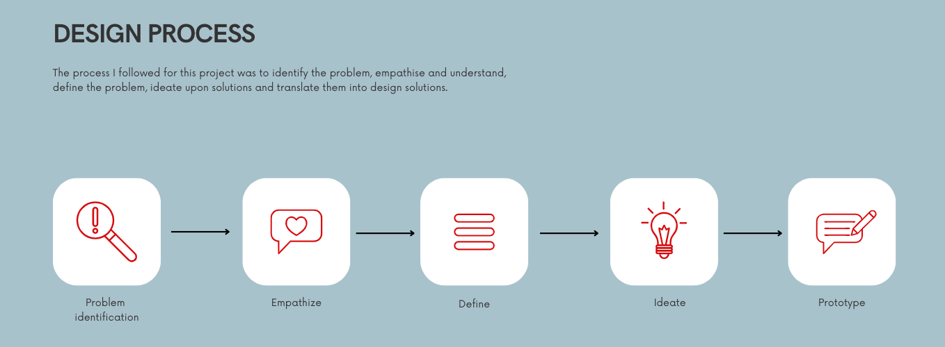
INITIAL RESEARCH
What is the problem identified?
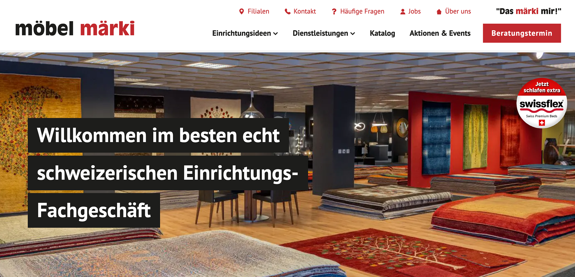
- First of all I needed to navigate the website myself in order to understand what is needed and what opportunities there are to make the website more user friendly.
- I was very confused as to what the website was offering, whether they were selling furniture or more of a service to help users design their spaces.
- The more I browsed the more I noticed that they didn't really have any products in sight, so for me it was more of a question of: what about the product?
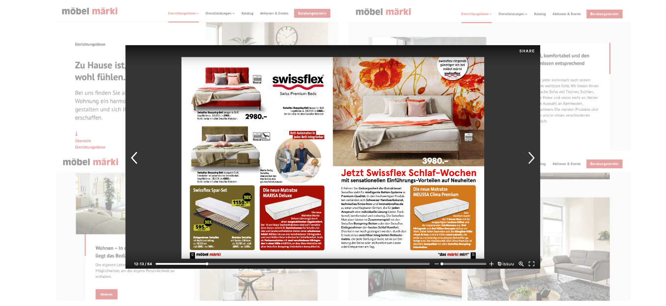
- Then I found out that everything is in the catalogue that you have to download.
This made me feel a bit frustrated, as I had to browse and click around a lot to find the product.
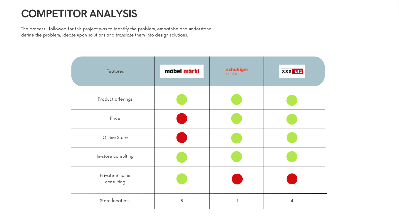
I decided to start an analysis of the competitors that are also on the Swiss & German market and that are similar to Möbel Märki.
Möbel Märki has services that really make it important and I think it is important that these services are highlighted.
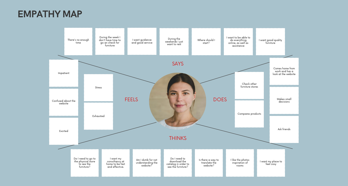
Based on an experience I had 8 months ago where Sara, a friend who just moved to Switzerland, I created a target user. She had just moved to Switzerland and everything was new and she had to start work very quickly and she was very busy. So she didn't have much time to go shopping for furniture.

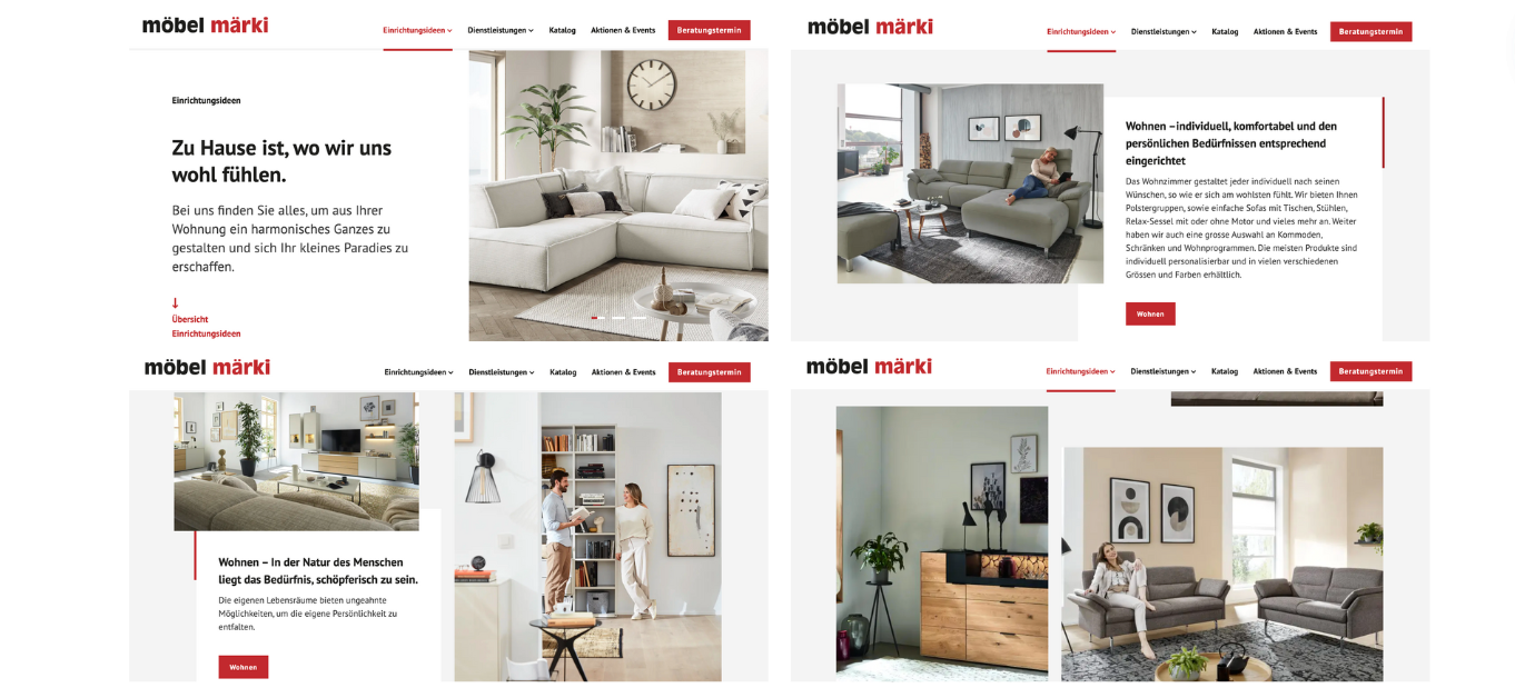
REDESIGN
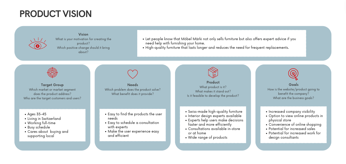
The goal of redesigning möbel märki's online website is to improve the user experience, increase website traffic and conversions, enhance the brand's online presence, while continuing to take into account the visual language of the brand.
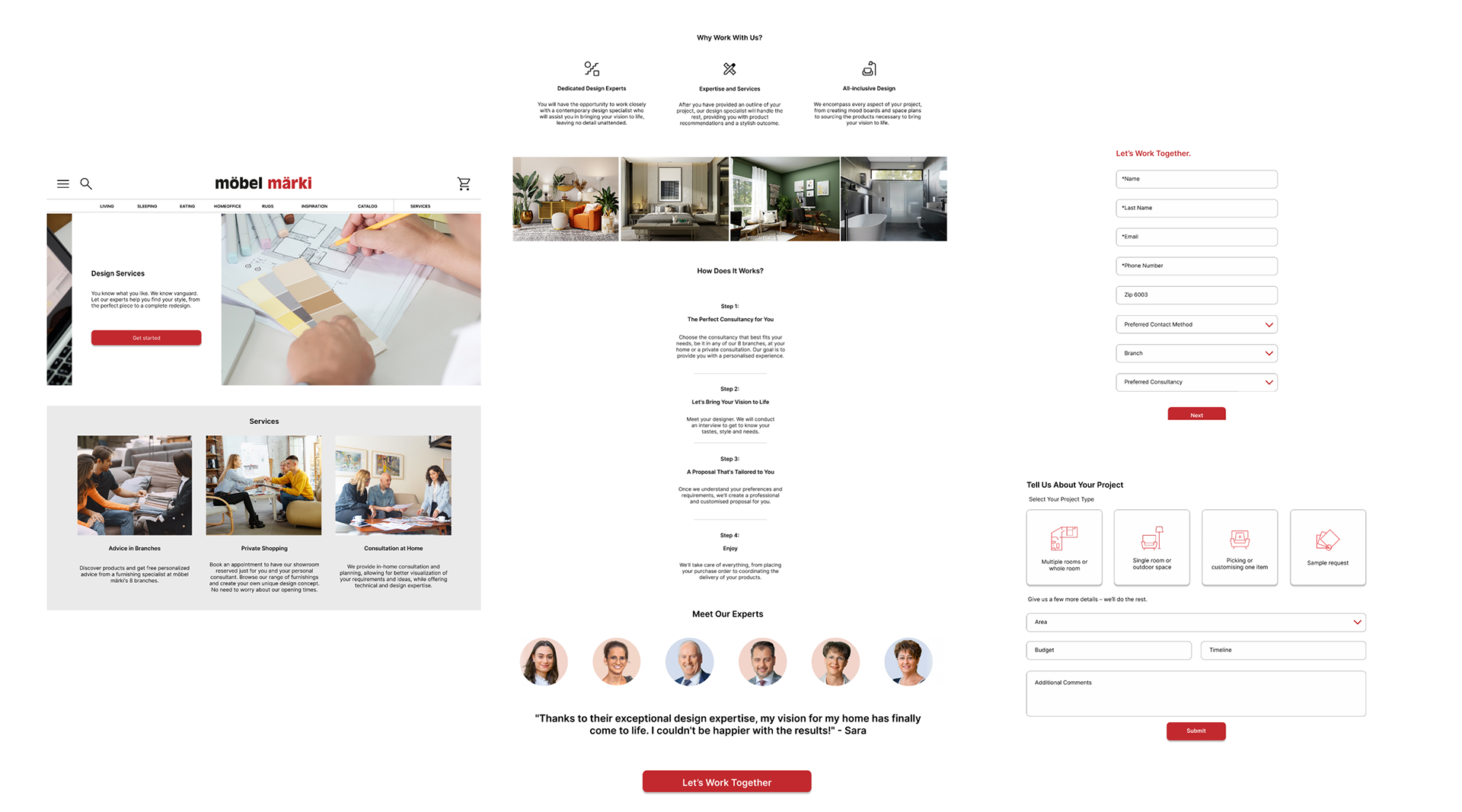
I decided to choose the section of the services they offer: which is design consultancy for clients looking to re-design a space in their home.
I decided to stick with the visual language of the brand, as I think it has been around for many years and it would not be good for existing customers if we were to change all of them. I decided to stick with the colour palette but improve the onboarding of the services in a more seamless way.
I added icons, photos and the team of experts. I also rewrote the steps and created a new contact form in case the user is interested in getting any of the services.